Brand Identity Redesign
Apr 2018
Apr 2018
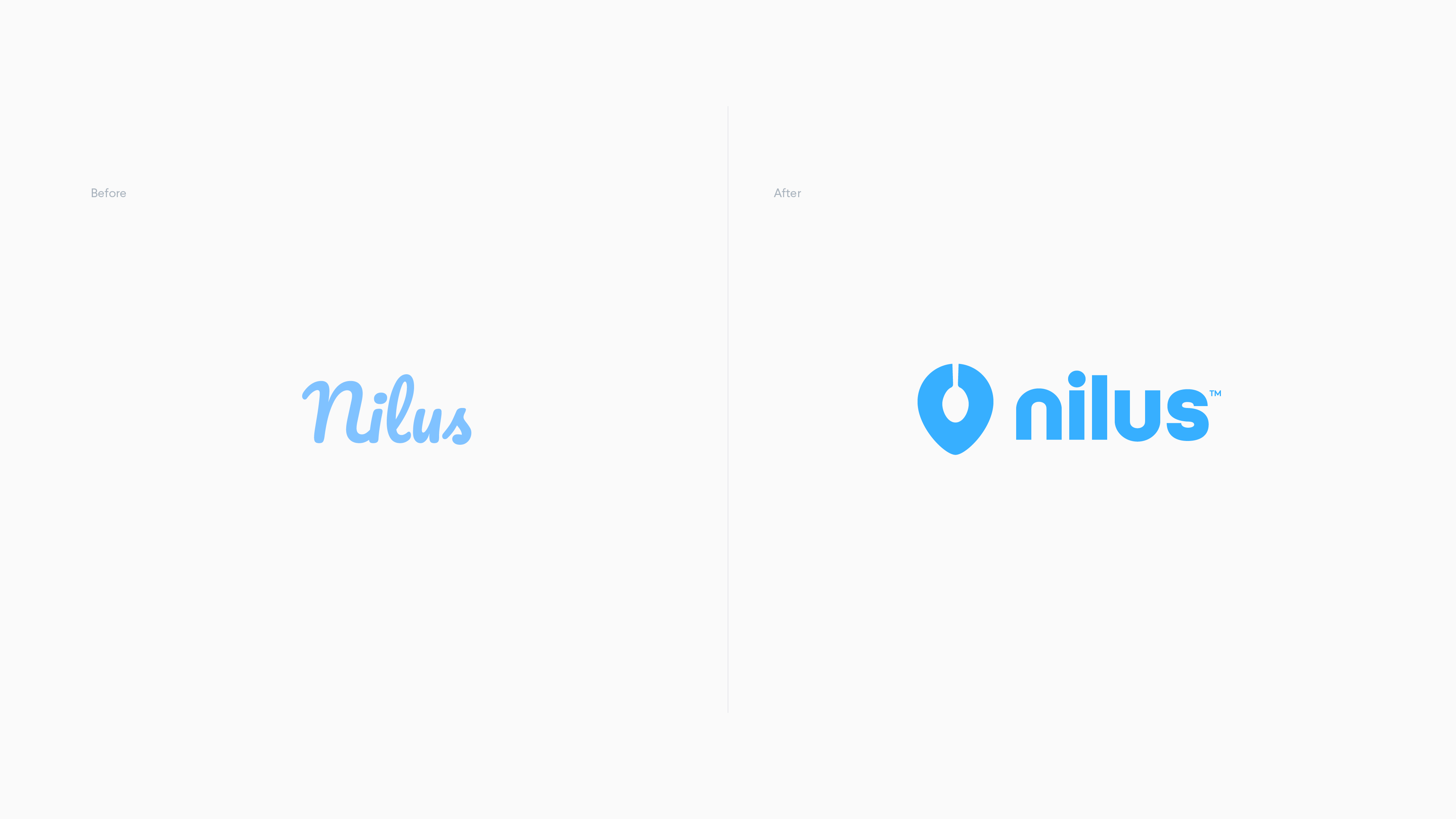
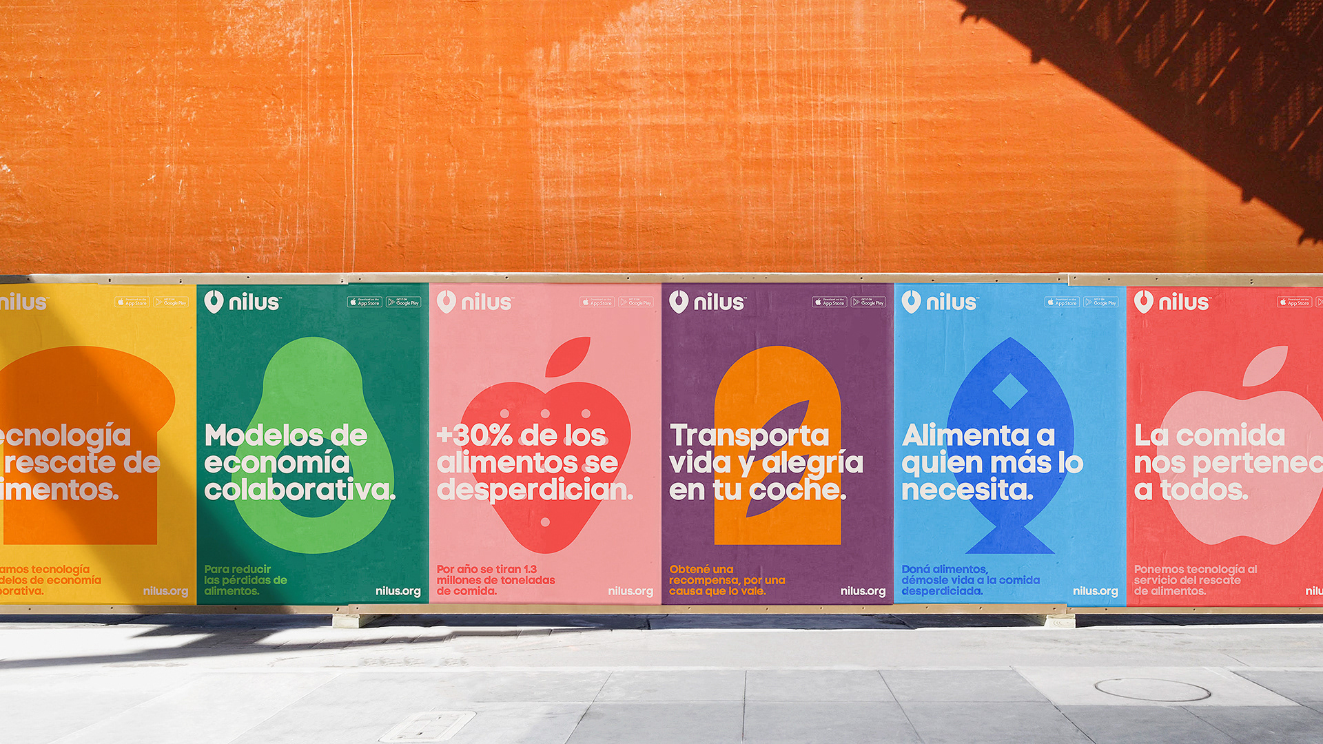
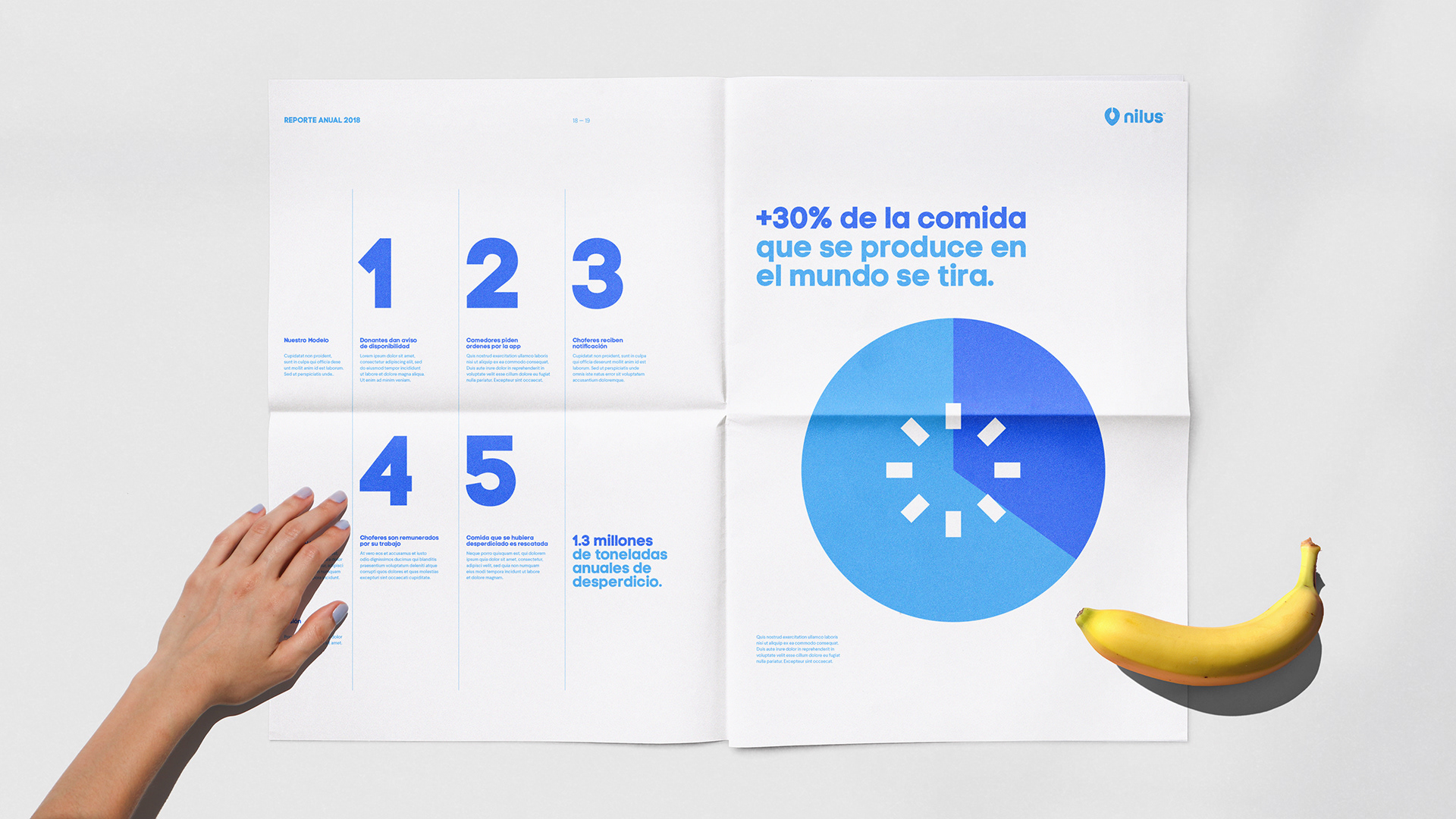
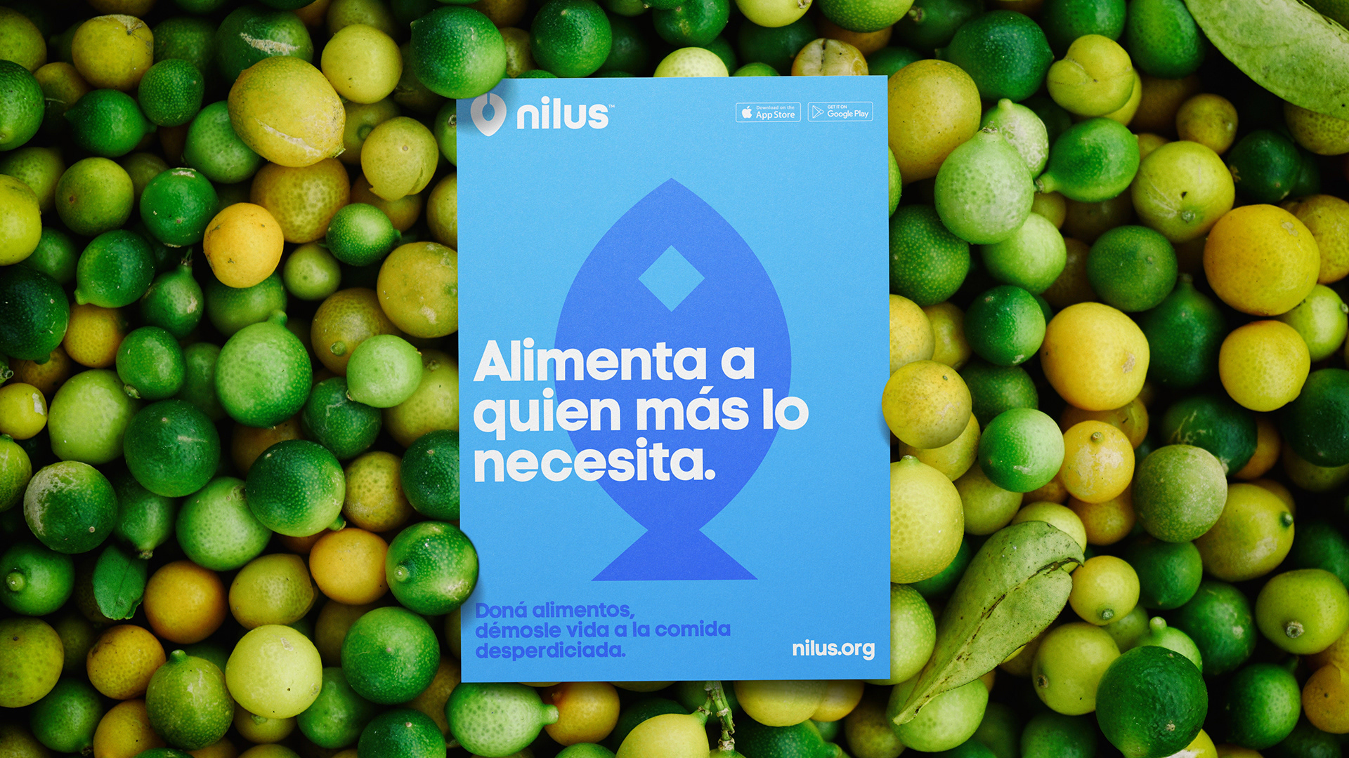
Nilus is a nonprofit organization that applies technology and sharing economy models to reduce food loss and waste. They aspire to digitalize the food rescue industry using crowdsourcing and geolocation technologies to connect food donors, community kitchens, social organizations in need and drivers, simply and intuitively.
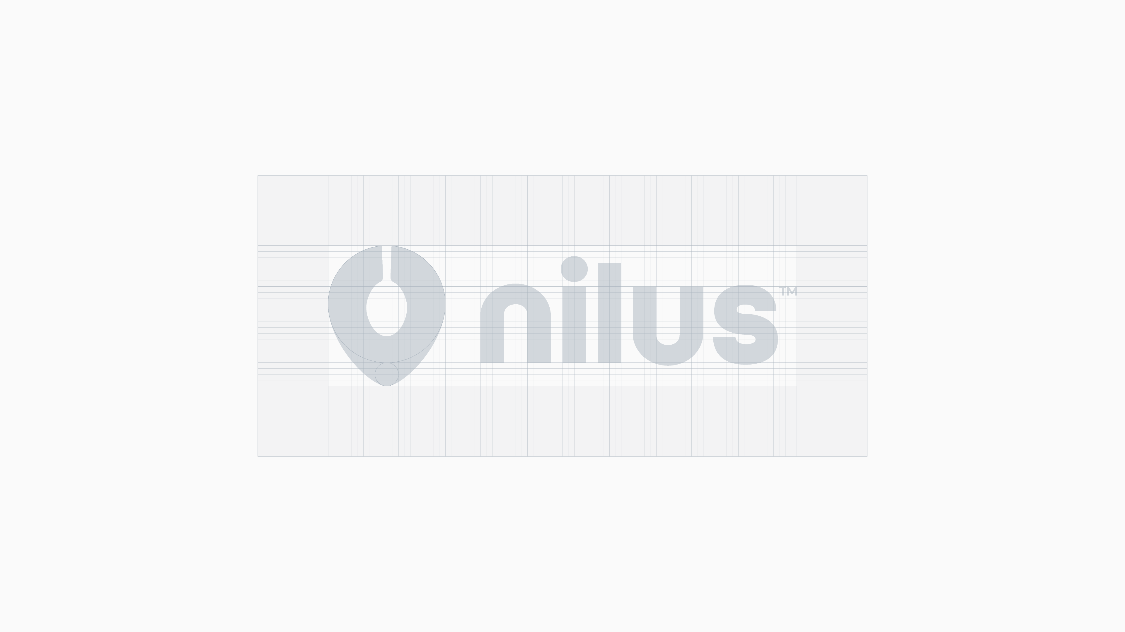
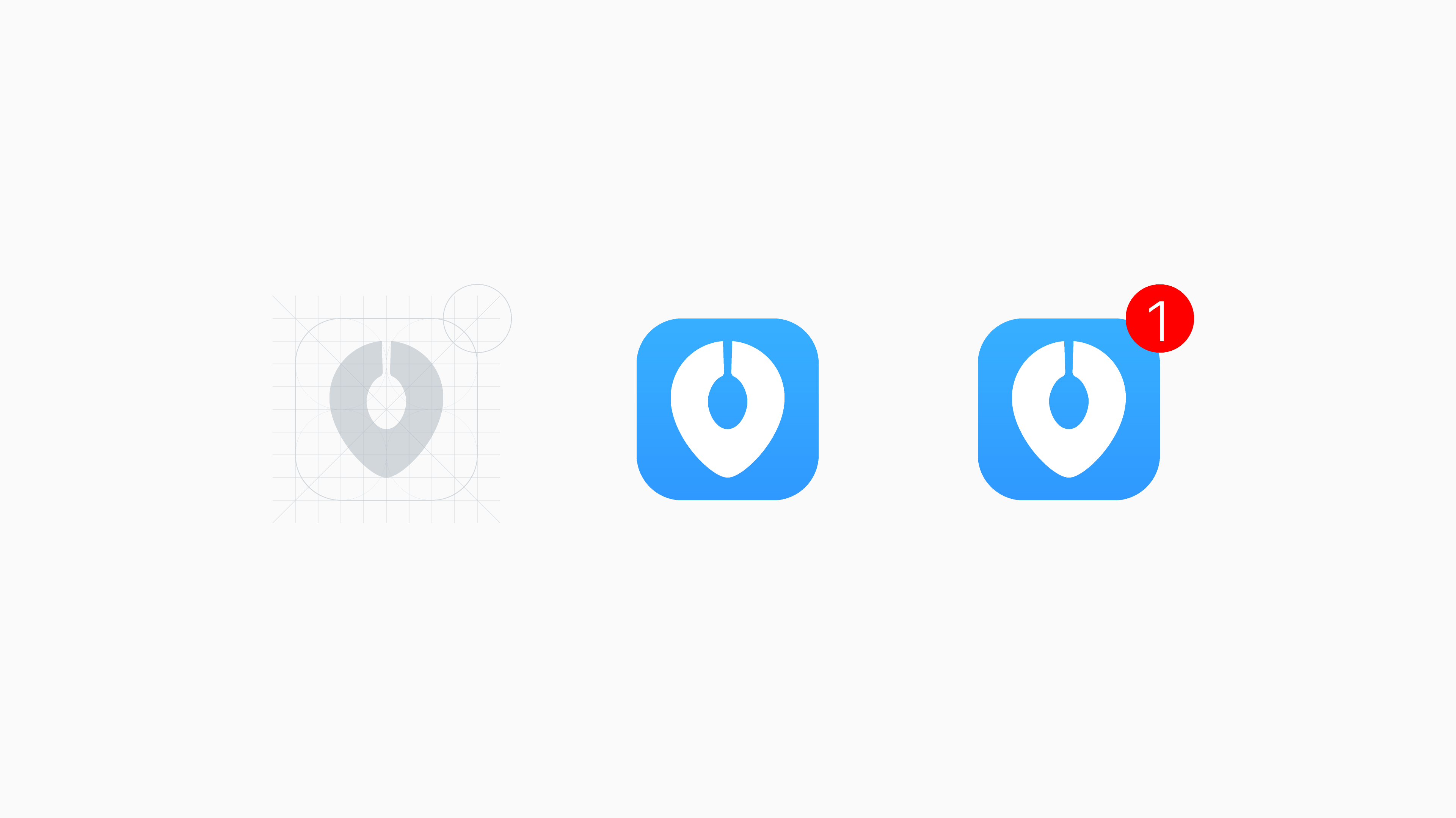
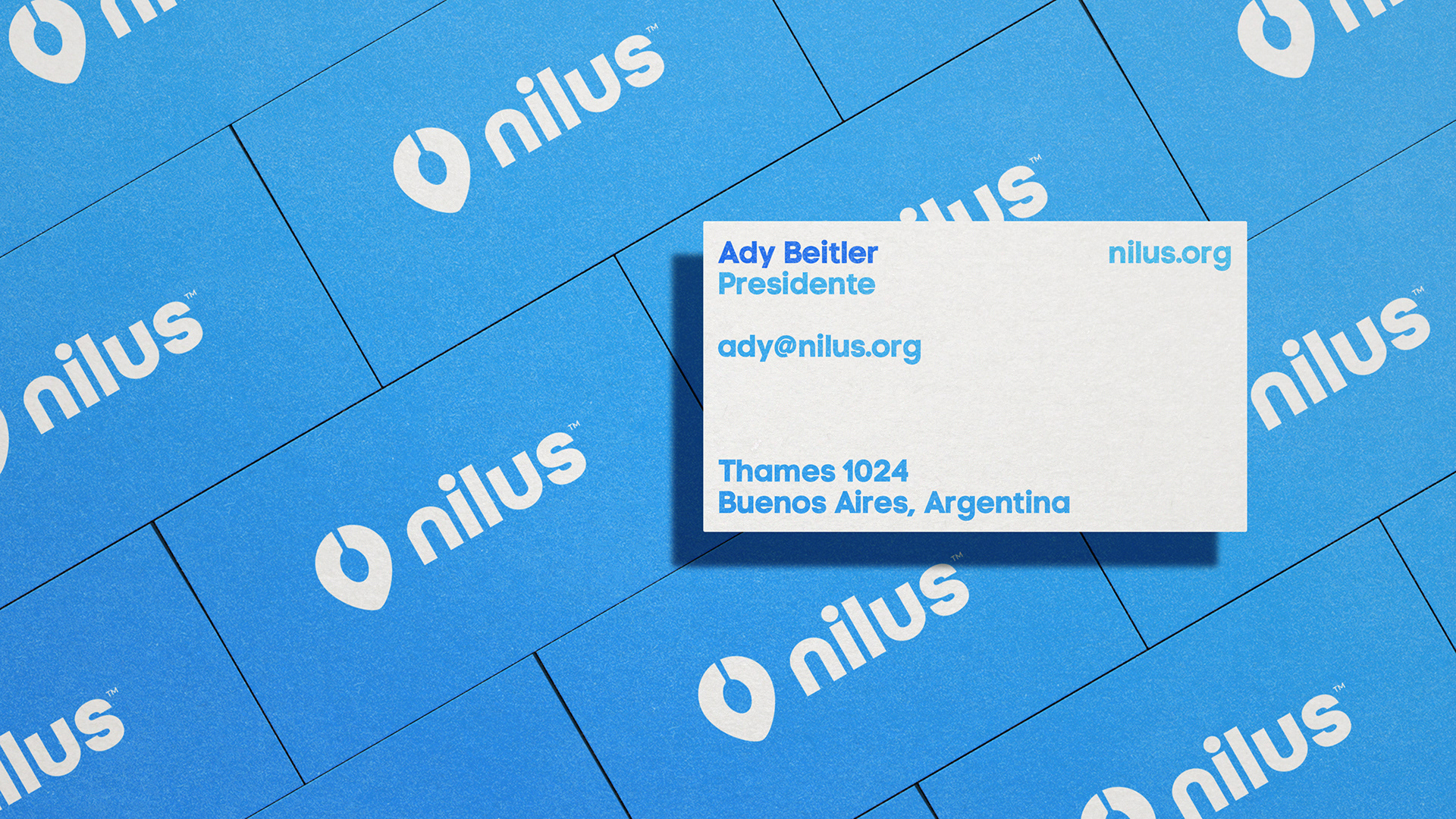
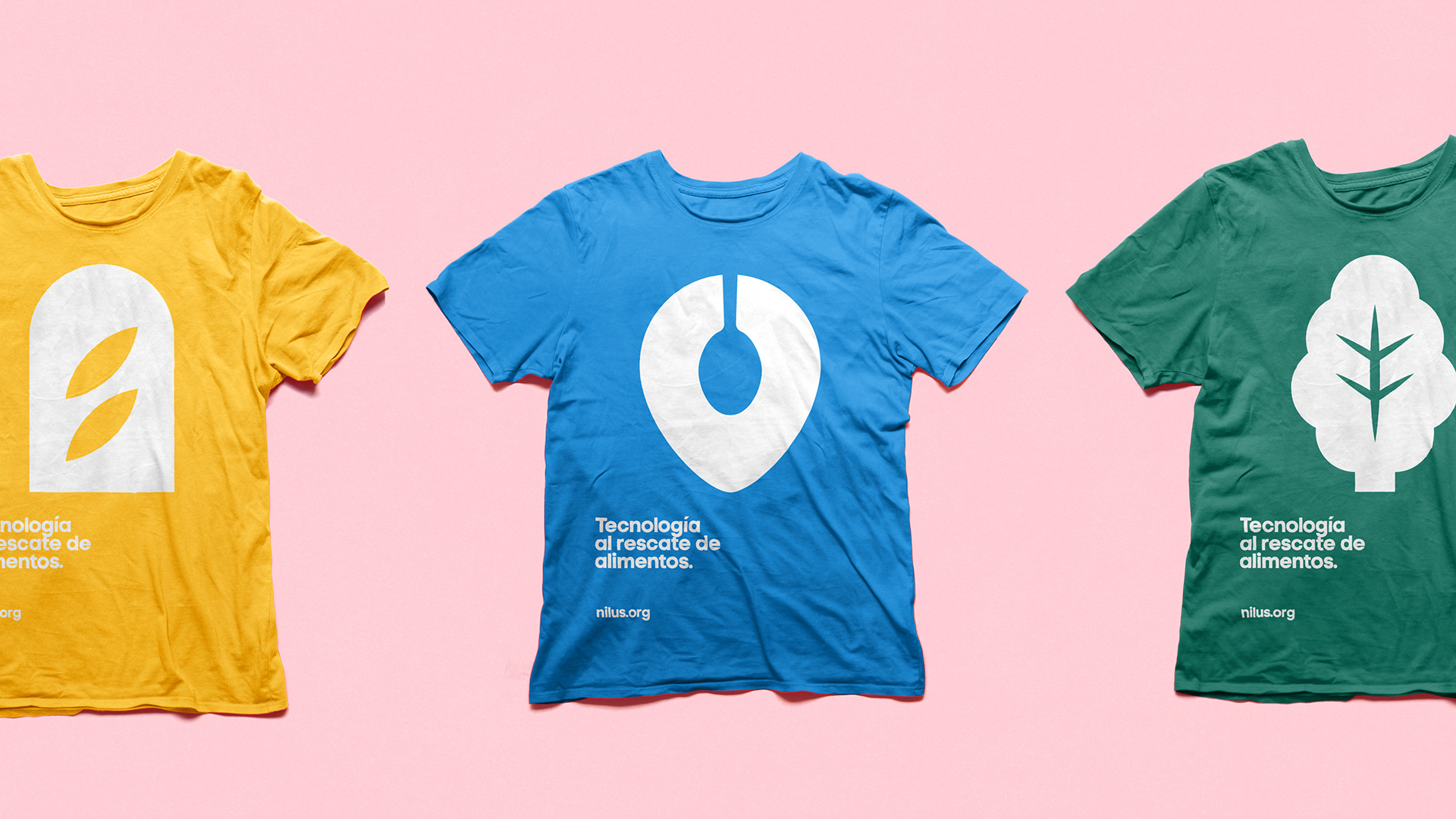
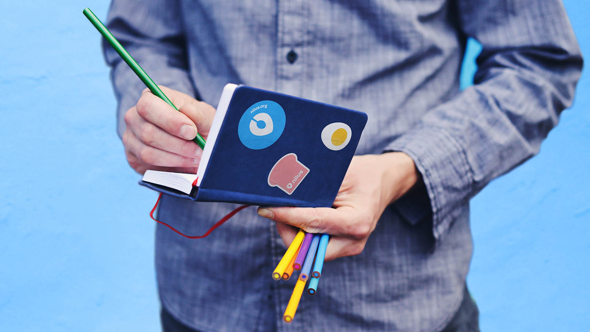
After winning Desafío Google.org 2017, they reached us for a rebranding. We then created an isotype that captures the essence of Nilus: the idea of technology and transport (geolocation pin) and feeding (spoon) condensed in a simple sign. Alongside we designed a simple yet appealing and friendly graphic language that could be easily scalable to use in their communication and implemented in the app UI. It consisted of a batch of iconic 2D illustrations, based on geometric shapes built on a grid, paired with bold typography and a colorful palette.